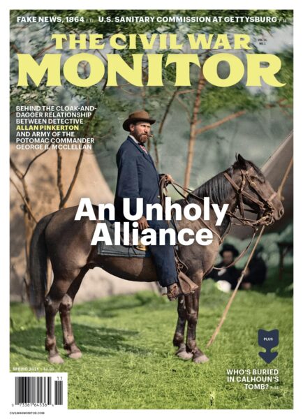
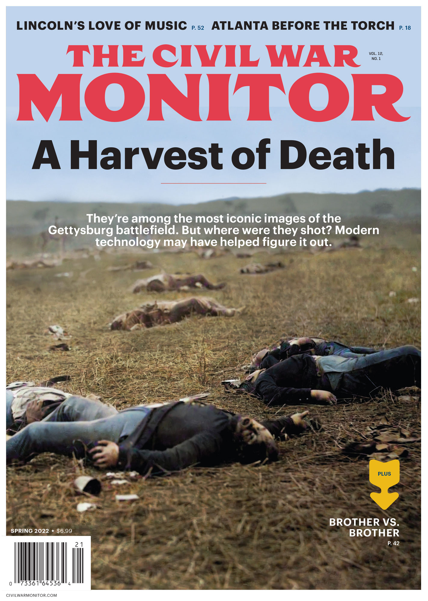
A HARVEST OF DEATH
Patrick Brennan’s article in the Spring issue [“A Harvest of Death,” Vol. 12, No. 1] raises two issues:
1. Colorizing period photos. I can buy that “computer analysis” (or eyes) can distinguish between a dark Federal uniform and a light Confederate one. But no way on God’s green earth can you distinguish butternut from gray in a monochrome picture. And if Robert E. Lee’s men were wearing gray, then Brennan’s coloring them butternut is not enhancing history, but falsifying it, which I consider a fair description of the entire colorization fad.
2. Locating the “Harvest of Death” photos. Aside from a swale in front, I see no resemblance between the burial party picture and the modern view shown. The other period view has more similarities to the modern view, but South Mountain is so far off that its ridgeline would look the same from anywhere on the battlefield. Consequently, that matching ridgeline proves only that the photographer aimed his camera in the direction of South Mountain.
In short, as to locating the photos, my verdict is “not proven.”
It would have helped if you had used some arrows to point out features the author thought the original and modern photos had in common. So would a map with the alleged viewpoints of the photos marked thereon. As it is, the graphics that accompany the article are more ornamental than useful.
John A. Braden
Fremont, Michigan
***
The Civil War Monitor’s Spring issue caught my eye at a local grocery store from the familiar photo on the front (I’m glad to see more and more Civil War photos being colorized). Patrick Brennan’s article really hit home with me due to the fact I had read William Frassanito’s Gettysburg: A Journey in Time. And Civil War photos have always been a favorite of mine. (Too bad the History Channel’s Battlefield Detectives is not still airing; this would have made a great episode.) I have since become a subscriber to the magazine and have purchased the Gettysburg burial map, things I’ve been wanting to do for a long time. So thank you and keep up the great work.
Lowery Young
Crowley, Texas
***
I urged author Patrick Brennan to pull his unviable Harvest of Death photo theory from publication months before it appeared in the Spring issue of the Monitor. One need not even examine his modern photos on site to see that he presents geometric impossibilities between the two historic photos—anyone should be able to divine that one would not see the reserve side (see page 38, left center) of the corpse in the foreground on the magazine cover by pivoting less than 90 degrees and taking a few steps back. That alone renders unnecessary any need for high-tech help or extensive justification of why his modern photos do not truly resemble the historic ones. To correct his angles would present numerous other impossibilities. I hope that one day someone locates the correct site, but it’s hard to see how anyone could believe this theory to be correct, except those who strongly desire it to be.
Garry Adelman
Brunswick, Maryland
Ed. Thanks to all of you for your feedback. We asked Pat Brennan if he cared to respond. He writes: “I’m sorry Mr. Braden thinks the colorizing process is a fad. I don’t. The AI colorizing process is far from perfect, but I found its accuracy to be of a high enough percentage that it can easily serve to enhance our understanding of history to a far greater degree than falsifying it. However, in regards to the first photo in the Harvest of Death series, the crucial finding was that the blue uniform color of the five Unionists in front was markedly different than the brown uniform color of the bodies in the background. That discovery brought the Elliott burial map into play. I spent a lot of time and effort figuring out how McPherson Ridge no longer resembles its Civil War appearance. Additionally, I described the detailed differences in the article. I would encourage Mr. Braden to read the article again looking for that specific information. By the way, nowhere in the article do I insist I proved anything.
To Mr. Young, my new book due later this year called Gettysburg in Color (Savas Beatie) should satisfy your desire to see more colorized photos from the Civil War.
Finally, I have great respect for Garry Adelman and his fine work for the American Battlefield Trust. We share Chicago roots, and I love to see local folks do well. Yes, Garry urged me to pull my ‘unviable’ theory from the Monitor. I contacted Garry and offered to run over all the material I collected on the ground in Gettysburg. However, Garry refused my offer (which still stands) and went to the site by himself. He was evidently uninterested in the many primary sources that point to this site as a possible location of the two photos. His quick trip there convinced him that my theory held no water, and he assured me his mind was closed on the subject.
Garry gave a number of reasons for his determination—all of which I addressed in great detail in the article. He has chosen here to relate in his letter what I assume he thinks is a knockout punch to my theory—the angle degree difference between the two Harvest of Death photos. I make very clear in the article that the second photo was taken almost due north and the first taken to the southwest, directed at the first dome on McPherson Ridge north of Fairfield Road. I also made this finding quite clear to Garry in our correspondence before the article’s publication. In fact, I computed the degree difference to be between 120 degrees and 130 degrees, which matches his own—and William Frassanito’s—computations. I have no idea how I can make this any clearer. The bottom line? Without realizing it, Garry actually agrees with my computations.
Since no modern photo of Seminary Ridge will match the background because of the massive work the Army Corps of Engineers performed to level the height’s contours, I included a generic shot of the ridge from the site. I should have made that clearer, for which I apologize.”
FIGHTING WORDS
I must take issue with an assertion made by Tracy L. Barnett in her column in the Spring issue [“Fighting Words: Grapevine Telegraph,” Vol. 12, No. 1]. Regarding the Civil War era, Barnett stated: “White Americans controlled the formal means of disseminating information—telegraph lines, newspapers, the political arena—and intentionally limited enslaved peoples’ access to education and information.” Perhaps that was true in the South, but it was not unilaterally true in the North.
It is my understanding there were a number of African-American-run newspapers in the Union states, that integrated schools did exist there, and that the words of men such as Frederick Douglass were widely circulated. Moreover, if northern informational channels were controlled primarily by white Americans, the reason was socioeconomic circumstance rather than deliberate exclusionary policy, and a great deal of the information these media provided was neither racially jaded nor tailored to suppress. That’s proved by matters such as publication of Uncle Tom’s Cabin, copies of which reached hundreds of thousands of Americans; the printing of countless newspaper and circular accounts of abolitionist meetings and sentiment; dissemination by voice and print of the Emancipation Proclamation’s provisions; and interactions between white as well as black Americans involved in the Underground Railroad, to cite just some initiatives.
But the main initiative, of course, was the Civil War itself. Think of how many white and black American families joined in putting their treasure and, certainly most valuable, their lifeblood forward to advance the promise of our Constitution and the synonymous dream Dr. Martin Luther King Jr. would express. Communication by communication, regard by regard, consensus legislation by consensus legislation, and love by love we are well along the way to realization.
John Wellington
Meadville, Pennsylvania
LAST WORD ON LEE
I am writing regarding Allen C. Guelzo’s article on Robert E. Lee in the Fall 2021 issue [“Rethinking Robert E. Lee,” Vol. 11, No. 3]. I found it a refreshing and modern perspective of Lee’s legacy.
I was disheartened, however, by some responses to the article in the Spring 2022 issue [“Dispatches,” Vol. 12, No. 1]. I would have thought and hoped that by 2022, most Americans would recognize Lee as someone who was not fighting for freedom and liberty. I find it impossible to reconcile the “Lost Cause” Lee with the Lee who enslaved people, who took up arms in defense of slavery, and whose family wealth was built on the backs of people whom he believed were owned. The reality of Lee as an enslaver of men, women, and children is in direct conflict with the values of liberty and freedom. One cannot be a champion of liberty and freedom and be an enslaver of human beings.
From this perspective, Lee should be viewed as a man who was willing to abandon his oath to preserve and protect the Constitution of the United States in order to wage war—a war waged to preserve an economic system that was dependent on the ownership of human beings. I don’t see any honor in Lee’s actions. As a result of his decisions and those of his counterparts in the Confederate leadership, the United States of America suffered a bloody war that killed hundreds of thousands. That is his legacy.
Robert Donnelly
Norwood, Massachusetts
MAP QUESTION
Did anyone else notice the signature to the right of the reference section on the map of Kentucky published on pages 44–45 in the Spring 2022 issue? Our 13th president was Millard Fillmore and that signature looks authentic, based on samples I’ve seen. The date of February 13, 1862, is written under the signature. Could he be the original owner of this map?
Frank A. Hollo
Colchester, Connecticut
Ed. Thanks for the question, Frank. We did a bit of digging on the Library of Congress website, where we obtained that copy of the Kentucky map. While the catalog description sheds no light on the issue, we did find several other digitized maps, dating from the 1820s through the 1860s, at the library’s site that list Fillmore as their “collector.” We’re guessing that’s also likely the case here.